Understanding layouts with CSS grid and flex
24 September, 2021 - 11 min read
This post is an attempt to better understand how CSS grid and flex work (individually and together, as it turns out). Like many others I tend to rely on a CSS framework (Bootstrap in my case) to do just about all content layout. CSS frameworks are great but it also important we appreciate what CSS brings out of the box with grid and flex in context of content layout.
This is also an exploration on if, and when, we may be fine to not use a CSS framework and, instead, rely on CSS grid and flex for content layout.
What is CSS grid layout?
MDN starts on CSS Grid Layout with the following:
CSS Grid Layout excels at dividing a page into major regions or defining the relationship in terms of size, position, and layer, between parts of a control built from HTML primitives.
The definition can take you only so far, so ...
What can you do with CSS grid layout?
How to do basic card grid layout?
We start with a bit of very simple HTML:
<html>
    <head>
        <link href="css-layout.css" rel="stylesheet">
    </head>
    <body>
        <h1>CSS Grid Layout basics - Cards</h1>
        <main>
            <div class="article">
                <h2>Card #1 title</h2>
                <p>Some text and description of different length</p>
                <img src="http://via.placeholder.com/300x300" />
            </div>

            <div class="article">
                <h2>Card #2 title</h2>
                <p>Some text and description of different length</p>
                <img src="http://via.placeholder.com/300x300" />
            </div>

            <div class="article">
                <h2>Card #3 title, a much longer title as it turns out</h2>
                <p>Some text and description of different length</p>
                <img src="http://via.placeholder.com/300x300" />
            </div>

            <div class="article">
                <h2>Card #4 title, with some more variants</h2>
                <p>Some text and description of different length. Some text and description</p>
                <img src="http://via.placeholder.com/300x300" />
            </div>

            <div class="article">
                <h2>Card #5 title, with some more variants, should be enough</h2>
                <p>Some text and description of different length. Some text and description</p>
                <img src="http://via.placeholder.com/300x300" />
            </div>

        </main>
    </body>
</html>
main is a container and we have a series of divs which represent our cards. With default Chrome rendering this looks like:
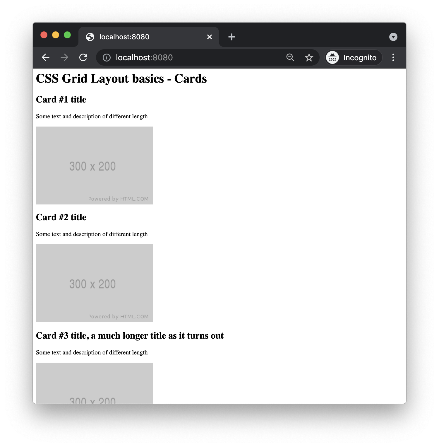
A standard browser rendering of our HTML produces vertical cards stacked one after the other.
Let's add some very basic CSS grid into this, just styling the main element for now (and some basic body level margins:
* {
    box-sizing: border-box;
}
body {
    margin: 10;
}

main {
    display: grid;
    grid-template-columns: repeat(3, 1fr);
    gap: 10px;
}
This produces the following:
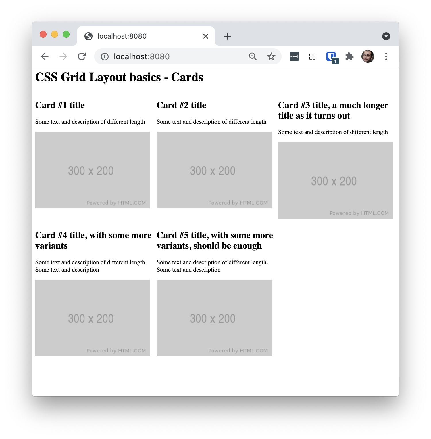
Page rendered with basic css grid use produces a gallery layout with some alignment issues
Not bad! We get three columns which equally expand (in width) to fill the available browser screen size. It is also responsive (... kinda ... but looks odd when stretched)! It is not production grade just yet, but certainly progress. Obviously we notice the odd alignment when the title is a bit long.
Making the grid responsive
We can get better responsive behaviour with the following adjustment to our css:
grid-template-columns: repeat(auto-fit, minmax(300px, 1fr));The important bit to note is the use of auto-fit as argument to the repeat(...) function. Instead of specifying "3" as 3 columns, now we are asking the browser to fit as many columns as it can, while making columns not smaller than 300px in width and equally distributing the available space. The resulting page looks as follows:
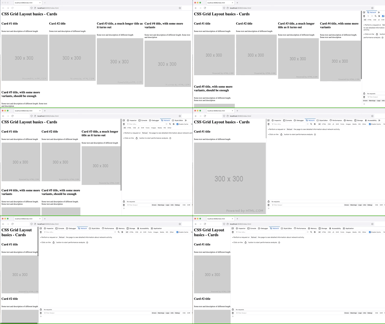
A more responsive grid, rendered with dynamic number of columns through use of auto-fit
Notice how we get a fairly decent responsive behaviour that goes from four columns down to one (my screen size did not allow for 5). I had to turn on inspector so that the browser would let me resize down to about 300px so that we can see all the "breakpoints".
Mixing CSS grid and Flex
While CSS grid is great and amazing and can do wonderful things it also exists alongside other great tools. Jen (linked in References below) offers guidance on combining grid with flex to achieve the responsive gallery layout we all want.
Adding flex to our div.article is quite simple in this case:
.article {
    display:flex;
    flex-flow: column;
}
The article is a class defined on each of our div cards. By default, display: flex does a row-based layout of content, so that flex-flow:column is necessary to get it to do vertical layout.
However, this change doesn't improve much on our previous state, it just adds some margins or paddings in each card as far as I can see:
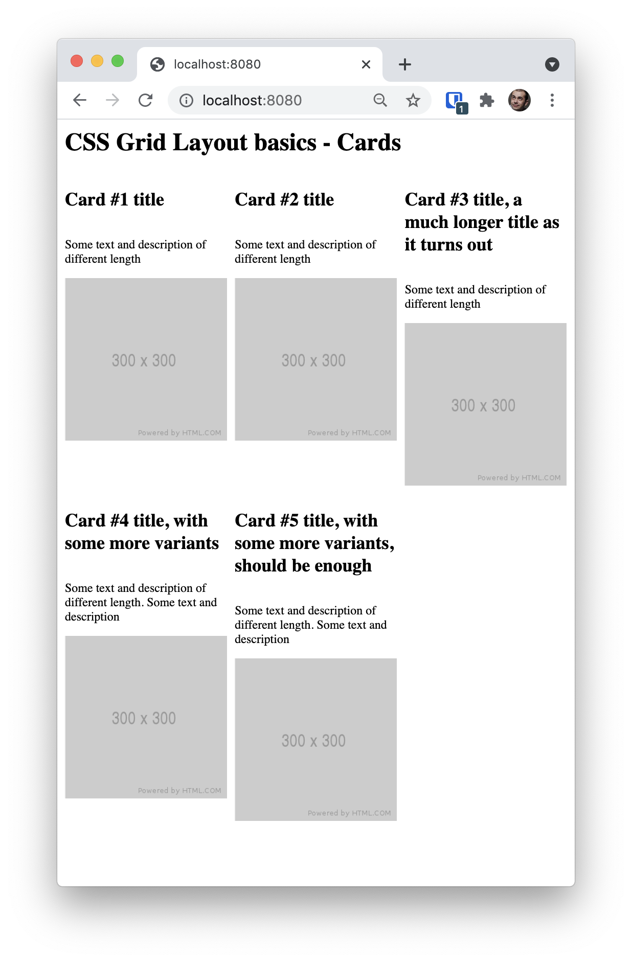
Adding flex to cards does not improve our gallery rendering
The next thing is to make our img elements within the card go above the title, which is easily accomplished at img level thanks to flex display:
img {
   order: -1;
}
Doing order: -1 makes the image element be the first within the card. The resulting page looks much better:
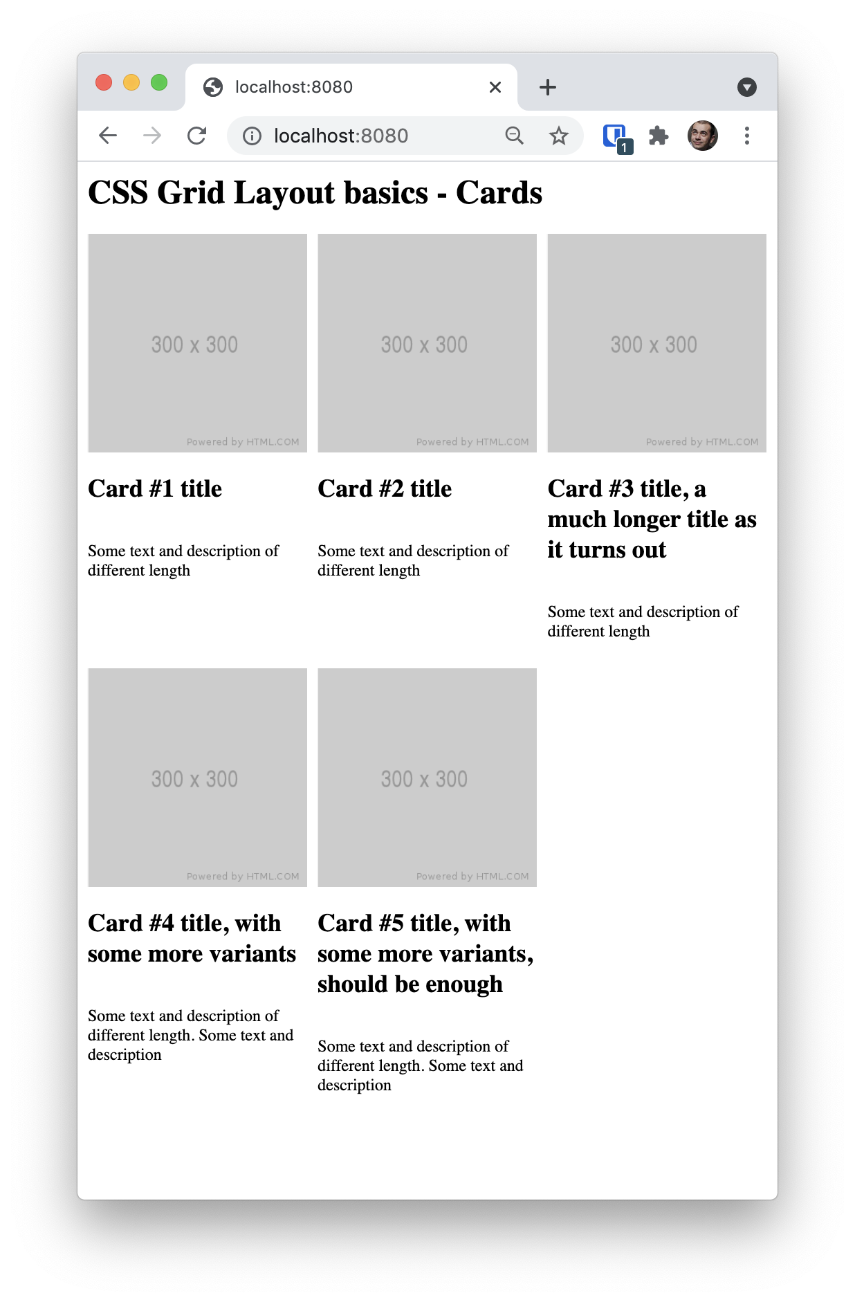
Adding order on card img element makes the alignment much better
The image is displayed above everything else and just because we're aligning the image first to the top of the card, the entire gallery layout seems a lot more sensible even without attempting to limit or constrain the other elements within the card in order to achieve a better, tighter alignment across all the elements.
Semantic HTML note
Note that our sample HTML looks as follows:
<div class="article">
    <h2>Card #1 title</h2>
    <p>Some text and description of different length</p>
    <img src="http://via.placeholder.com/300x200" alt="placeholder card image" />
</div>
The h2 heading and the p description go above the image for better accessibility. However, once we use flex and order CSS on this layout (as described above) we visually still get images above headings while supporting better accessibility order of our HTML.
grid-template-columns property
grid-template-columns grid property describes the columns within the grid. Commonly, we then use repeat function to specify the repeating pattern for our columns in the grid. We have to be careful on how the values for columns are specified as they may produce some undesired overlaps when rendered.
For example, if our image is 300x300px (as in the example HTML above), and we have the following column definition (notice the param for minmax(...)):
/* minmax value can lead to overlap if not in sync with content size */
grid-template-columns: repeat(auto-fit, minmax(200px,1fr));
The resulting grid will have an overlap as the minmax will allow for less space than the image width. It ends up looking as:

Overlap problems due to inappropriate use of minmax() and the content we have
To explore what else can be done, we can control each column explicitly (instead of using repeat(...) in the grid-template-columns. As an example here is a definition of 3-column grid with columns being 100px, 100px and 300px in width, respectively:
main {
    max-width:10000px;
    display: grid;
    grid-template-columns: 100px 100px 300px;
    gap: 10px;
}
This produces a three column grid where columns are fixed in size and do not change in any way as we resize the browser. This looks as follows:
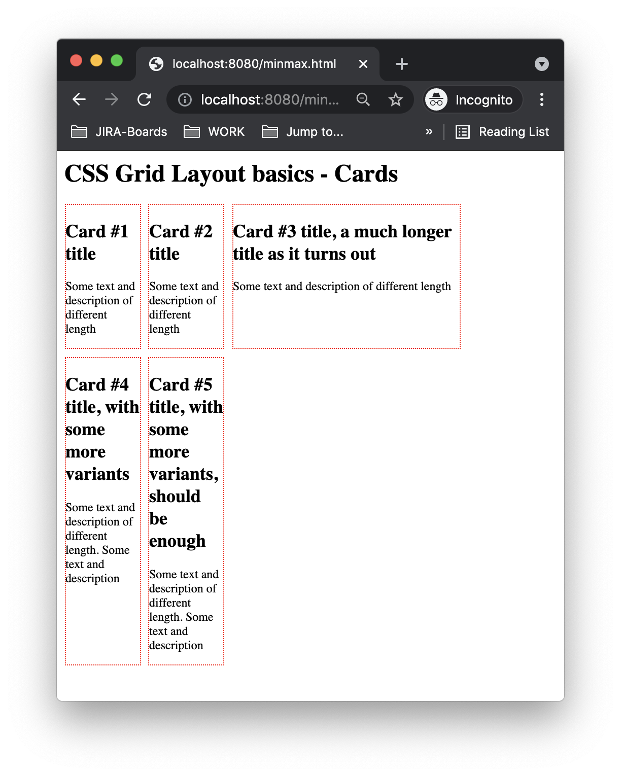
An example of a fixed column width rendering of our grid
Note: I've removed the images from HTML to more easily illustrate the differences in sizing. If we had the images with the above CSS grid definition we would still have those annoying overlaps. I've also added a border: 1px dotted red on the .article to more easily show what's happening.
We can specify the min and max values for each column, too:
grid-template-columns: minmax(100px,100px) minmax(100px,200px) minmax(200px,300px);This produces the following:
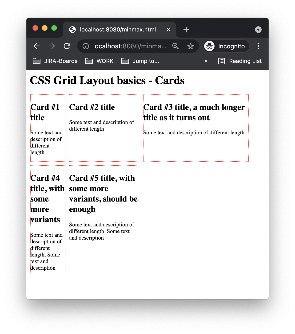
An example of a grid that allows for growth of 2nd and 3rd column, as defined in minmax
Resizing the browser grows the sizes of 2nd and 3rd columns up to the maximum value as specified in the minmax(...) function earlier.
Finally, introducing dynamic resizing as a fraction of free space, the browser completely fills the available space. The CSS is:
grid-template-columns: minmax(100px,100px) minmax(100px,1fr) minmax(200px,1fr);The 1fr portion makes the 2nd and 3rd column further grow into available space in the browser as seen below:
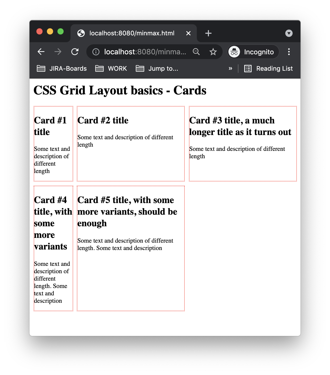
An example of grid that grows to fill entire available space, due to use of fr fraction units
minmax(...) specifies the minimum and maximum sizes of a column. The first parameter is a minimum value a column should have and the 2nd one is the maximum. The tricky bit is when we express either of these with more complicated values. What I mean by that is that if we simply say
... minmax(100px, 300px);This specifies minimum content size of 100px and maximum 300px. Very rigid and fixed.
However, if we do:
... minmax(100px, 1fr)Now the lower limit is still 100px so content will never be less than that. But the upper limit is expressed with fractions which are flexible and depend on the available space in the browser. The browser figures out whatever space is available and distributes it across columns we defined with fr as maximum width, allowing them to equally share in that space.
There are some keywords to be aware of too:
... minmax(min-content, 300px)In this case, the minimum size of a column will correspond to whatever the minimum size of the content contained in the column. So it could shrink quite a bit if we have very little in there. The maximum is fixed to 300px.
Please refer to MDN for more details.
repeat() function
There is a repeat() function that allows us to define column properties (such as width) which can then be repeated some number of times - either completely or a set number. The repeat() function can be put alongside other minmax()-based columns - thus allowing us to specify a repeating pattern as well as certain specific columns in the grid.
As an example:
grid-template-columns: repeat(3, minmax(100px,100px)) minmax(200px,1fr);This repeats 3 columns of 100px in width and then adds a 4th column that is minimum 200px in width and will stretch to the available space. Resulting page looks like this:
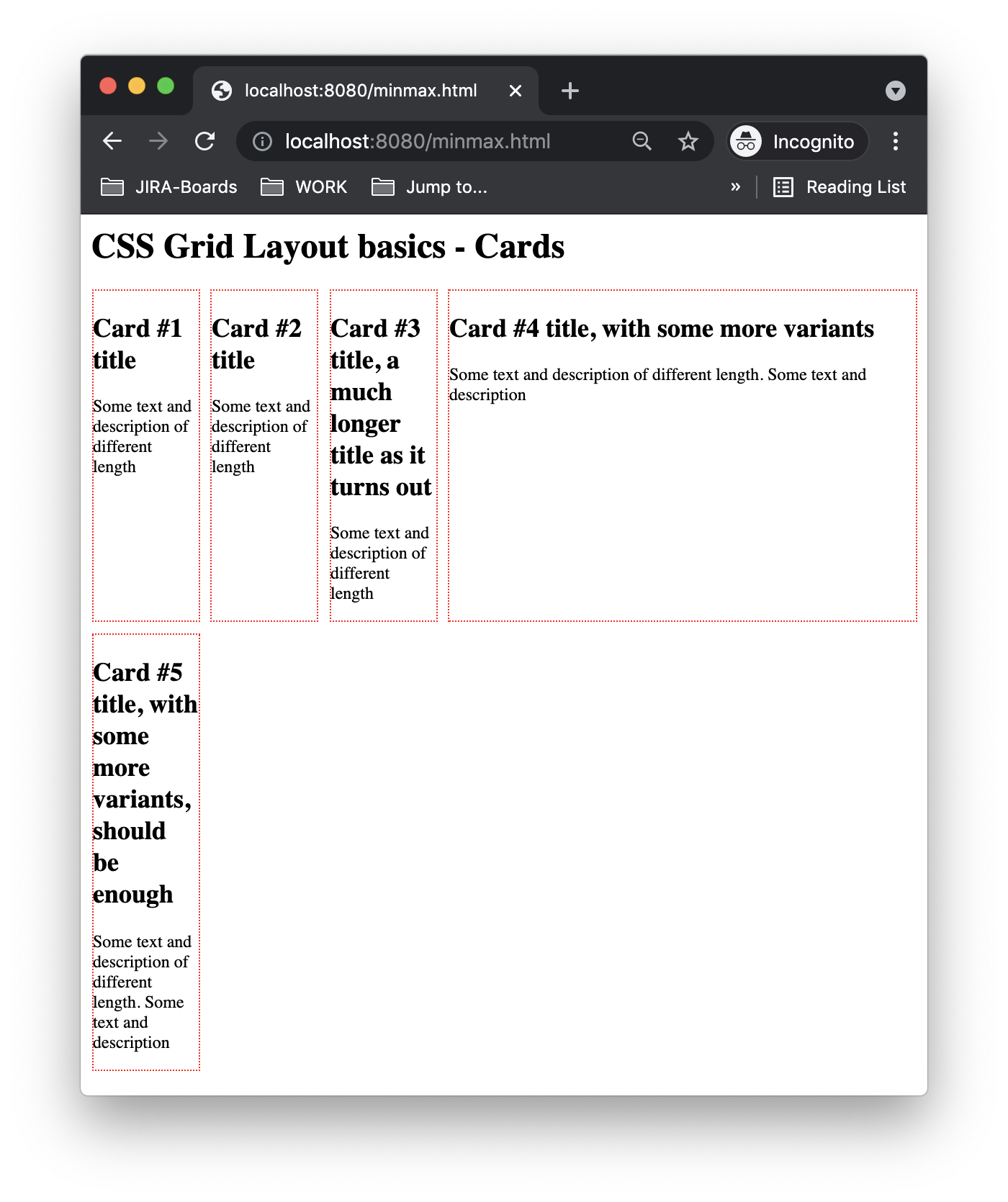
Combining use of fixed width columns as well as repeat pattern columns in the same grid allows for defining fixed width to the layout together with more dynamic set of columns at the same time
CSS grid and media queries
CSS grid does not rely on media queries to achieve its responsive behaviour. It is the browser that does the heavy lifting and computation as it lays out content given the constraints defined for the grid.
If we don't use media queries then, as far as I know, we can't have explicit control over content layout for particular screen sizes. That may be just fine in certain cases. For example, creating a gallery page of all the content that should simply automatically fill the available space of the screen we are dealing with.
Obviously if we do care about particular screen sizes then we are back to square one and can introduce media queries first and then within that context either define multiple grids or, perhaps, start using the CSS framework of our choice.
Comparing CSS Grid layout with Bootstrap
An important part of CSS grid layout is that it does not deal with sizes of screens in the same way in which Bootstrap does. It does not rely on media queries at all. That also means that CSS grid layout does not recognize a mobile view and a desktop view and therefore can't adjust the rendering for that particular screen size. It simply fills available space by laying out the content following the rules defined for the grid.
In contrast, Bootstrap allowed us to control what gets shown on a mobile phone-sized screen, IPAD and desktop through the use of media queries (which are implicitly used as we rely on Bootstrap's md, lg, etc screen size shortcut classes). Interestingly, Bootstrap 5 grid system relies on flex when building out the equivalent album page example (columns, cards and elements within cards are all flex display).
The thing about grid layout is that it allows us to achieve a solid gallery view without the need to learn a CSS framework.
Is that "production ready"? Close. Maybe not 100%. We get decent responsive behaviour, too.
Do I try to not have a CSS framework at all? I doubt it. Chances are the frameworks are here to stay as we can get great default behaviour (albeit with some learning curve). But who hasn't spent time learning the framework of their choice by now?
References
- Jen Simmons video on Flexbox and CSS Grid together for gallery layout got me started to look more into this
- MDN on CSS Grid Layout
- MDN on grid-template-columns
- Bootstrap album example is a gallery (album) sample that does a similar layout, so worth investigating to contrast with the above
flex-basiscss property on MDNrepeat()function on MDNminmax()function on MDN